Also called “updating your logo,” a Logo Refresh cleans up your logo, brings it up-to-date, and makes it stronger. Oftentimes, is simplifies an overly complicated logo, or corrects colors and elements that reproduce poorly.
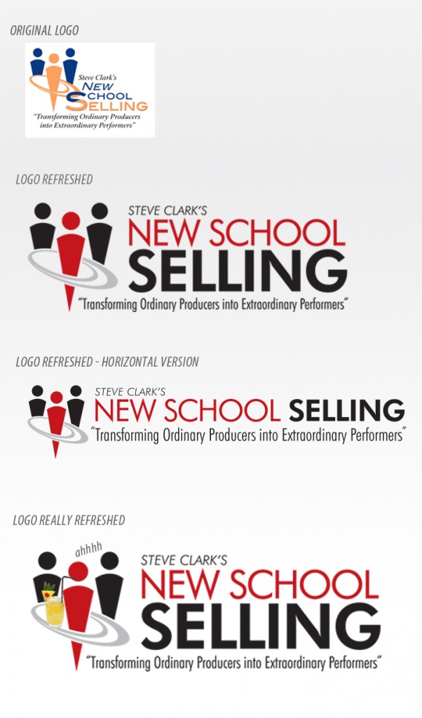
Here is an example of a recent logo refresh we completed for Steve Clark’s New School Selling.

His previous logo had soft, uninteresting colors (yellow/orange and a toned-down blue). The text was complicated and busy. We liked the simplicity of the shapes of the people. And Steve wanted to change his color palette to red, the consummate power color.
The new logo is cleaner er, stronger, easier to look at AND easier to reproduce at both large and small sizes.
We created a compact version, and a horizontal version for use in different applications.
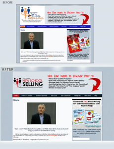
Here is how it looks like on his website:
The key to a logo refresh is to maintain your brand look so people don’t wonder if you’re a different company. If your logo can use a refresh, shoot it over to us and let’s see what we can do.

