Disclosure: We’re not a newsletter farm. We don’t mass produce newsletters for hundreds of people and corral them out the door every month.
But we do design and produce several newsletters, and because we cater to the few, the proud, and the purposeful, those newsletters are pretty fabulous to read and gorgeous to look at.
And, based on our clients’ feedback, get impressive results.
You’ve heard the typical advice on how to make an effective law firm newsletter: mail it consistently, make it interesting, don’t just talk about law stuff.
That’s all true and excellent advice.
But we have a few unconventional tips of our own that will not only get you a terrific newsletter, but help you get it done.
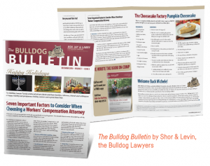
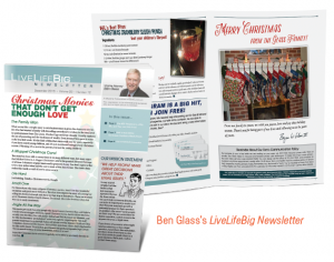
Personal Injury lawyer, Ben Glass and Bulldog Lawyers, Jay and Larry, report to us they get rave reviews and fantastic feedback on their newsletters.


In fact, all of our newsletter clients report that, when sent regularly, their newsletters are the number 1 source of referrals and new cases.
Here are our tips for implementing an effective newsletter campaign:
1- Don’t clutter it up. Four to six articles is all a 4-page newsletter needs. We like to think of your newsletter as having a cup of coffee with your subscribers. It shouldn’t take them more than 10–20 minutes to read through it. Sometimes, de-cluttering your newsletter is a matter of arranging the text and graphics better. When everything in the newsletter is competing for your attention, the mind gets overwhelmed. But with some strategic design decisions, the same information can be transformed into a beautiful and inviting presentation.
2- Create engagement. Add a call-to-action for each article. But here’s the kicker, you’re not allowed to make the action a “free consultation.” Instead, how can you engage your readers on a fun, human level? Here are some ideas: Run a contest, ask them to submit a picture or story on some subject, offer a scholarship based on merit, solicit their ideas and opinions on a controversial subject. Be creative.
3- Use tracking. If possible, use a unique, trackable phone number and URL on your newsletter. That way, you’ll know if people are contacting you via the newsletter. However, keep in mind that your newsletter is a “nurture” campaign. In other words, people may contact you in a different way, but the reason they thought of you was because they receive your newsletter. It’s not always each to track that. The “engagement” tip above will give you a better idea on whether people are reading and responding to your newsletter.
4- Create sections or departments. This makes it easier to create content. In the Bulldog newsletter, sections include a holiday message, an informative article, a recipe, a quote, and a firm update. When you know what kind of content you need, it’s easier to get inspired or get to work creating content for that section. (Our own Breathe Life newsletter uses this same strategy.)
5- Keep a content repository. Sounds fancy, but it’s just a running file of article topics and content that you write in when you have time, or when you have a great topic idea. It can be a notebook or a Word file you keep in cloud storage like Dropbox so you can access it anywhere (inspiration can come at the strangest times).
6- Make it attractive. This a sneaky repeat of Tip #1. Because, well, we think your marketing should be beautiful. It’s a reflection of your style and your success. Besides that, a polished, professionally designed newsletter draws the reader in and makes your newsletter more inviting and more readable. Remember, design is more than how something looks, it is about how usable it is.
Want to spice up your newsletter life? Or get a newsletter life? See our Exceptional Newsletter Package. We’ll send you real samples of the gorgeous and effective newsletters we create to give you some ideas. We’ll also send you a before/after makeover of a newsletter that’ll help you see these tips in action.
